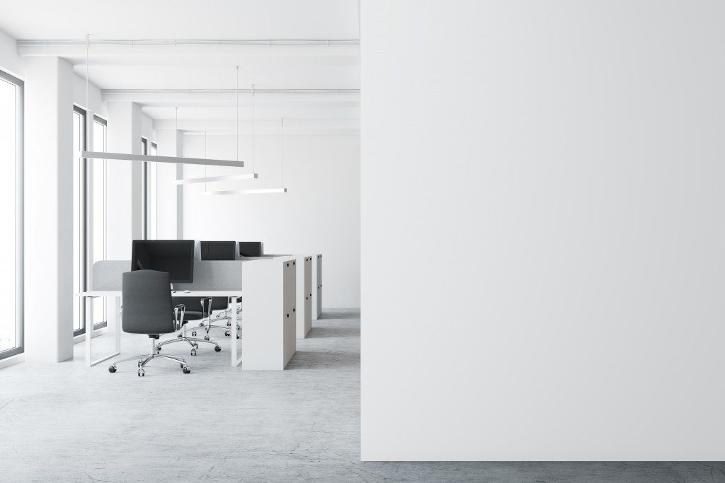
Minimalism is in, especially in office interiors. A lot more businesses are embracing the simple, neat aesthetics given its rewards: distraction-free, clutter-free, stress-free. It helps employees be more productive.
If you’re thinking of revamping your own space to reap such benefits, here are the steps to perfecting the minimalist interiors:
Choose your furniture wisely
Office furniture does so much to the look and feel of the space, precisely because they’re the most noticeable and the first thing people see when they enter. In minimalist interiors, furniture is even more important because they provide the storage you need in keeping surfaces neat and organised.
Note that there’s a smart way of choosing pieces. Keep in mind these three things when shopping for furniture: simplicity, versatility, and flexibility.
- Simplicity means going for pieces that have clean, plain lines, and patterns. If you could go for neutral tones, the better.
- Versatility pertains to multi-purpose pieces. Some modular indoor benches feature built-in charging ports, so they serve not just as a seating furniture, but also a tech fixture. This eliminates the need for long cables strewn across your floors, which clutter the look of the space.
- Flexibility refers to furniture that can easily be reconfigured. Invest in adaptable desks, which can be used while sitting or standing. This will save more space in your office.
Make it open
One thing you would notice in minimalist office interiors is how ‘light’ the entire thing is. It feels as if you’re so free when you’re in the room. That illusion is created by its openness, the fact that there’s less floor area occupied and filled. Even though you don’t have a big space, you can create that open feel.
One way is to follow natural sightlines. Create a smooth flow from room to room with glass office partitions. Victoria interior designers explain that this helps maintain sight lines and at the same time, maximise the natural light coming from your windows, contributing to the open feel.
Another way to create that atmosphere of openness is to use design elements to draw the eyes up, like recessed ceilings and eye-catching lighting fixtures. When eyes are up, the space looks more expansive.
Prioritise negative space

Negative space is a concept in interior design that refers to a blank, empty area in the room. Minimalist interiors use a lot of negative space, which ultimately gives a simple and neat look. Your office would become more aesthetically pleasing when there are strategic places dedicated to negative space. These offer a ‘breathing area’, a corner in which people can rest from all the visual stimulation in the room.
There’s no hard rule in assigning spots for negative space. The general principle commercial interior designers follow though is edit, edit, and edit: When you finish your design, look around again, and see what can be taken off. That might be a huge art piece or the plant next to it.
When it comes to office interiors, simplicity and neatness win. It makes employees work more productively. When revamping your workplace, remember the mantra: less is more.

